Architects
MATHIAS KLOTZ + CARME PINOS
33°24’30.3 “S 70°34’03.6 “W
Las Condes, Chile
2017
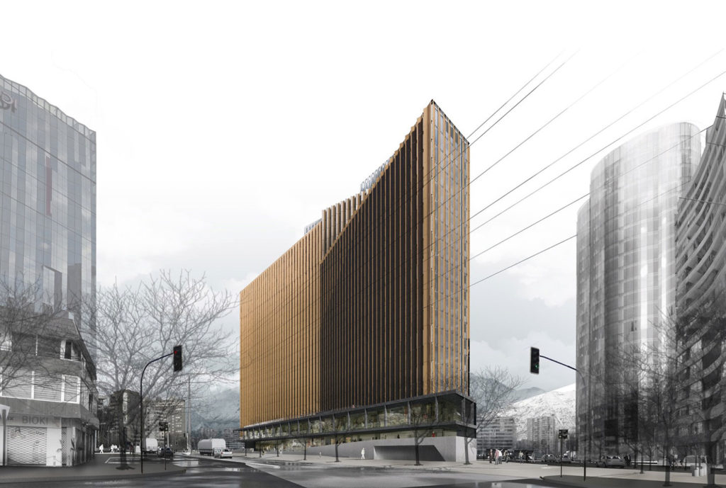
The project was approached as a volume that dematerializes, allowing the eye to cross this body and read its thickness, maintaining the continuity of the urban box, through four operations:
Fissure: it is a volume that is crossed by these openings that allow from the outside to recognize its thickness, to cross it with the gaze; and, from the outside, to read geographical and urban landmarks.
Offset: it consists of offsetting the volume in section, so that its parts allow the eye to explore its interior. This is especially visible in the plate which, through these offsets, breaks the perception of a closed body and allows the sidewalk to enter the interior of the building.
Broken Plane: the façade plane that makes up this urban box folds to achieve an increased perimeter (and thus greater exposure to the sun and ventilation) and at the same time to allow dematerialization.
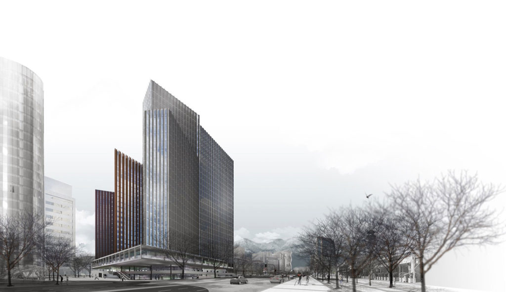
Skyline Cut: The different volumes of this body maintain in their height an independence that leads to the perception of a diverse skyline, which also contributes to the break of this volume.
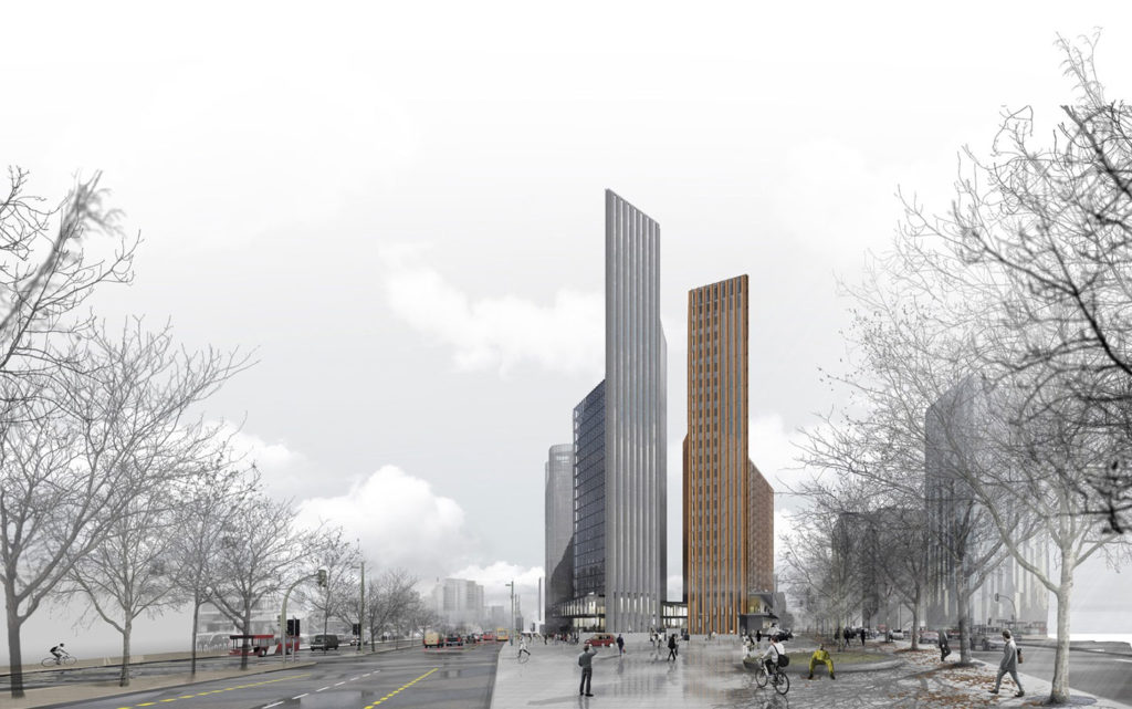
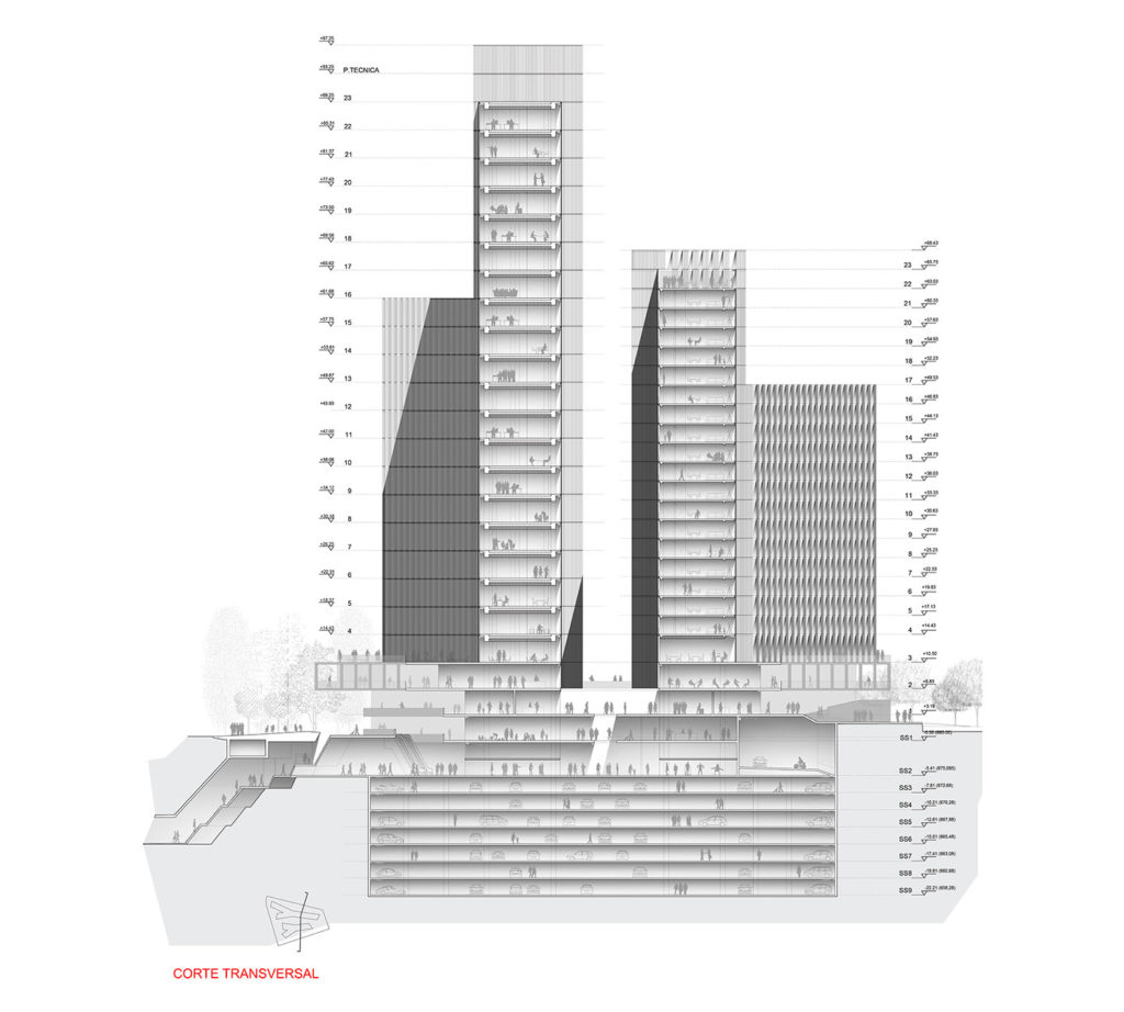
The proposal has been studied from all perspectives, prioritizing the view of the whole, from Avenida Apoquindo to the west, with two slender volumes of different heights that approach each other without touching, leaving between them a crack of light through which the sunset will peek and from which views of the mountain range and the San Cristobal hill will open up. The building has a ship’s prow condition and its physiognomy exalts a sharp perspective that makes it look slender and light from the urban space, which is resolved with a discreet treatment of the pavement that gives continuity between the heart of the complex and the farthest vertex of the corners.
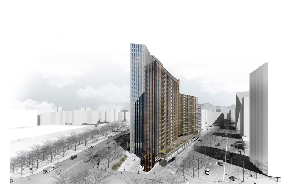
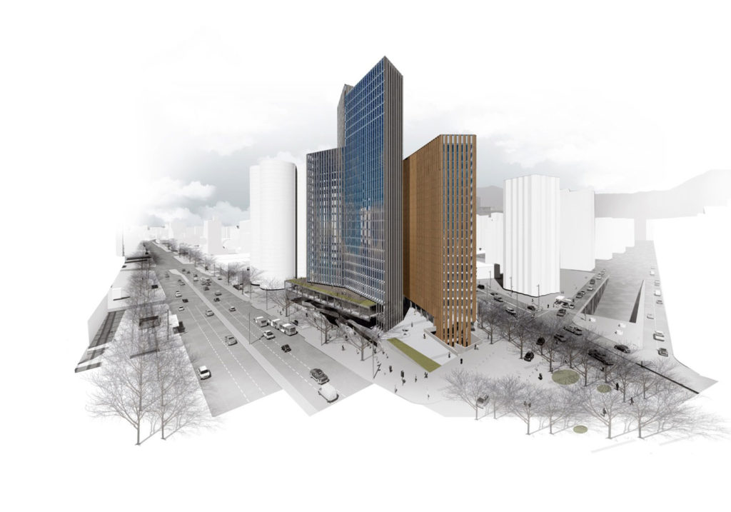
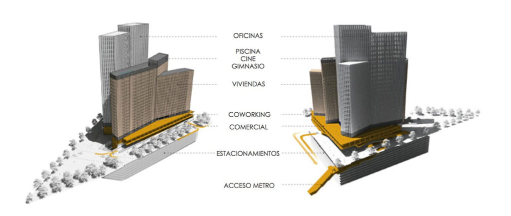
The project is resolved with two parallel buildings whose volumes are decomposed to reduce the visual impact and which rest on a commercial plate that connects them to the urban fabric. The skin of these volumes is treated in a homogeneous and similar way to give a sculptural reading to the whole, although differentiated in terms of color and brightness.
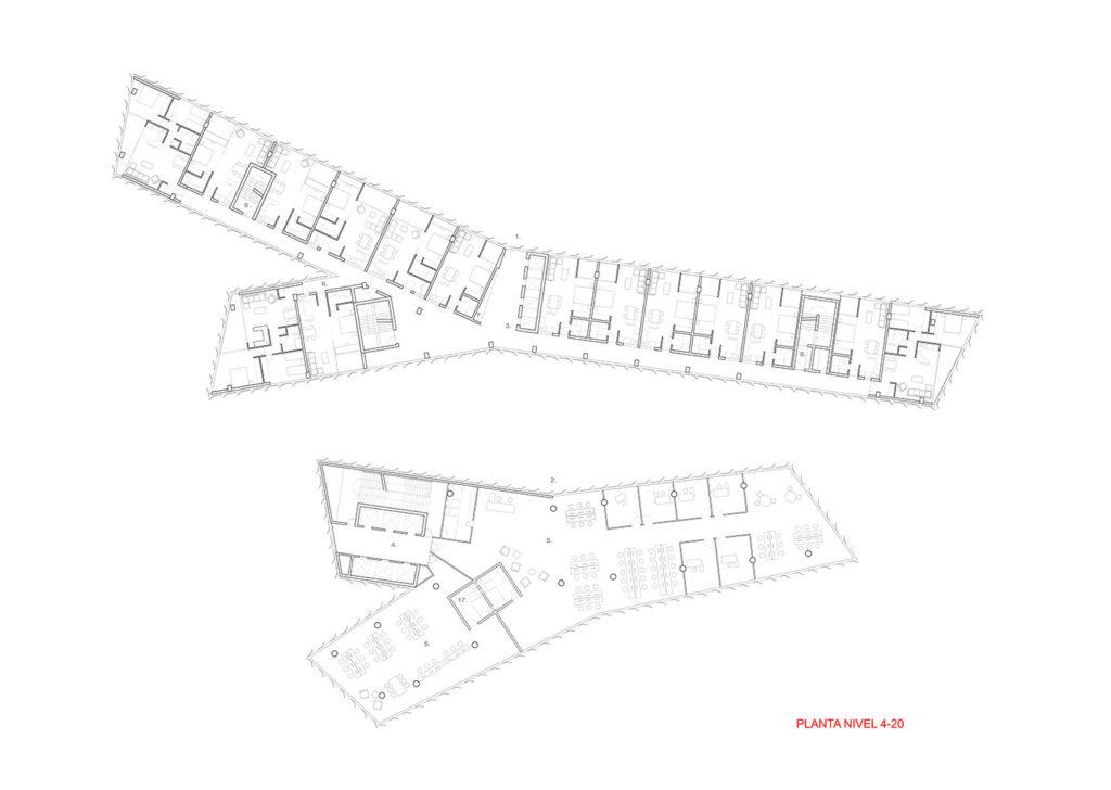
Each building contains a program; the residential building, oriented to the north, seeks comfortable sunlight for the dwellings, while the office building is oriented to the south, seeking greater comfort for work. Both are protected by a perforated folded sheet brisolei, with variable geometry and degree of opacity, which in the case of the housing units provides protection from the sun, while the offices provide privacy. An opaque orange-brown color has been chosen for the residential units, while a warm gray, reflective titanium color has been chosen for the offices. The elements of the brisolei have been arranged in vertical strips and with a fold to reinforce the verticality of the whole, while achieving a façade in movement as one circulates around the volumes. The whole will change its appearance as you walk through it, going from being very opaque to very glazed.
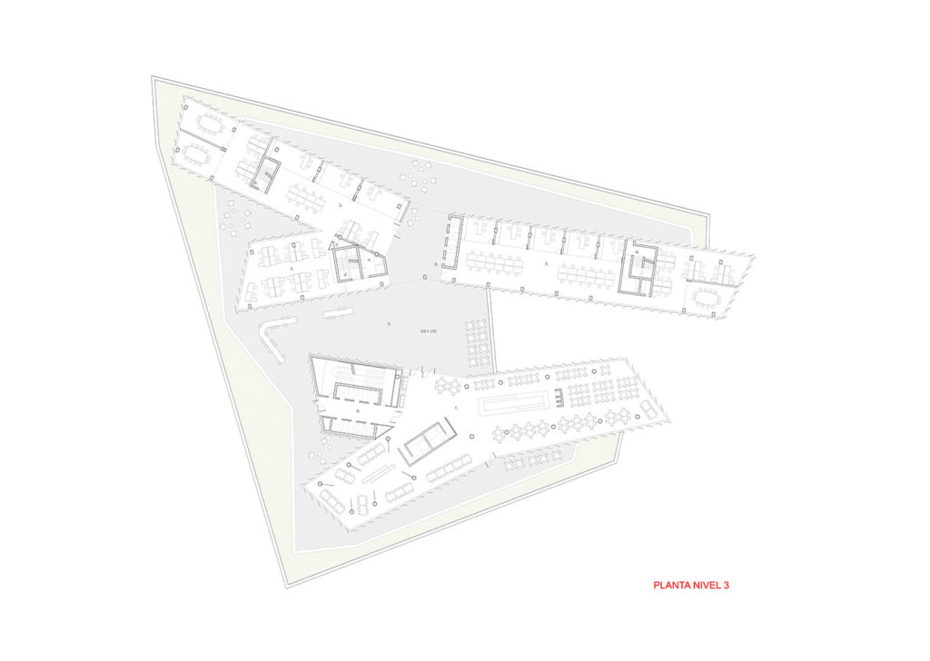
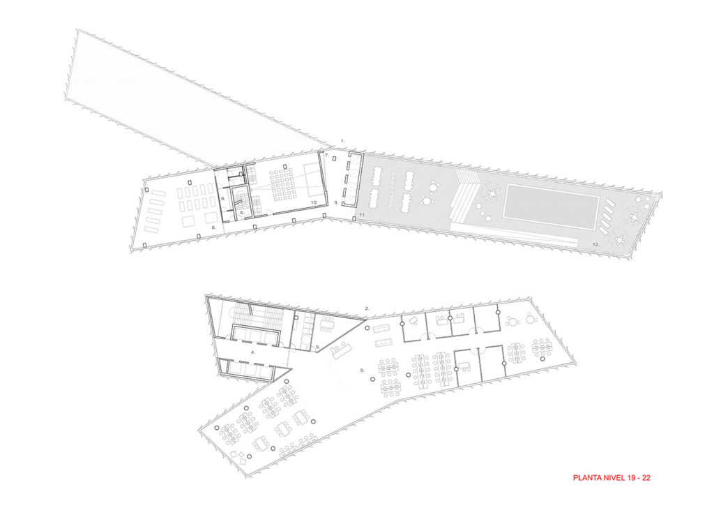
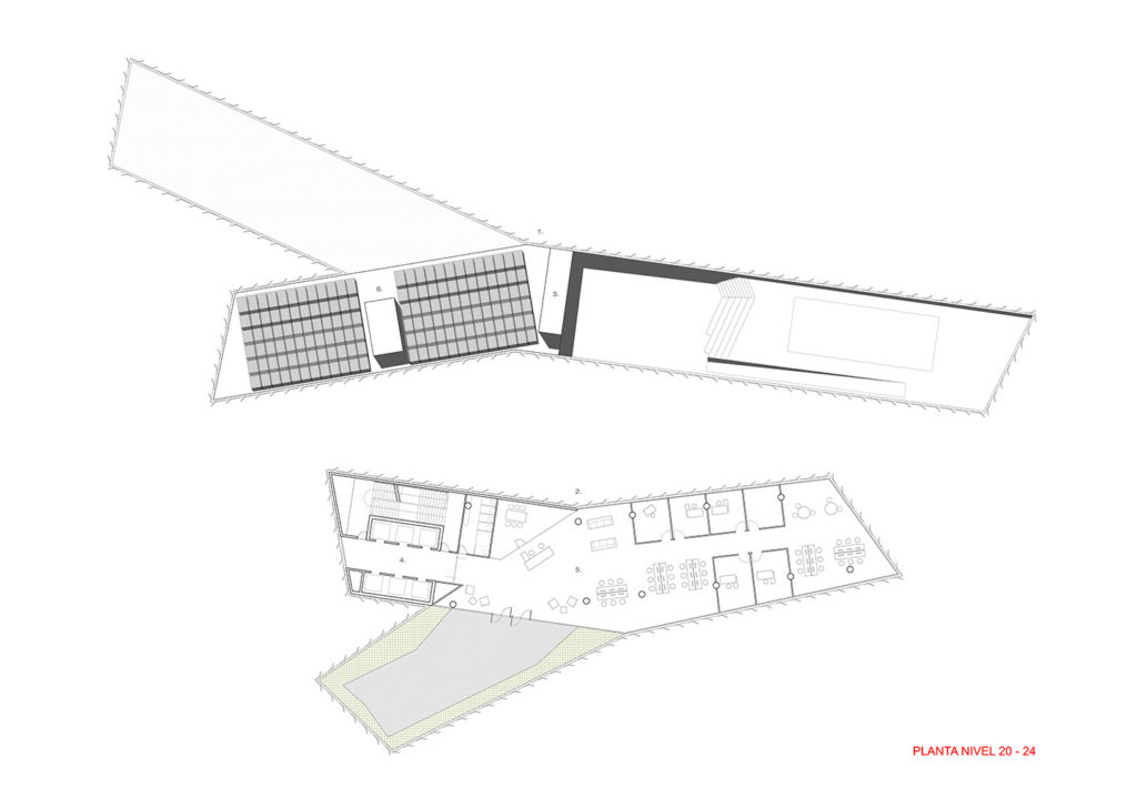
The contact surface of these buildings with the commercial plate is destined to common spaces and the roof can be used as a garden, extension of co-working services and cafeteria. On the upper level of the residential building is the gym and swimming pool to enjoy not only the good views but also more sun and privacy. The commercial plate is resolved with the aim of creating a fluid space in which the circulations will be open to the outside, not only to move away from the concept of a shopping center, but also so that the flow of people becomes the facade of the project, giving it dynamism.
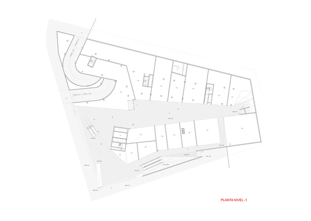
The structure of the upper level of this program has been designed in cantilever, to create a large urban atrium for access and exit of public transport flows that are concentrated in Avenida Apoquindo with O’Connell, to penetrate the heart of the program in an expeditious manner. To reinforce its natural vocation as an intermodal station, this plate has been provided with a significant number of guarded bicycle parking spaces at the level of direct access to the subway.
The commercial plate is set back between the two buildings, creating an entrance plaza to both the residential building and the office building, making this space into a vertical hall almost 100 meters high, which is naturally illuminated by reflections from the north façade of the office building. On the level above the commercial plate, the floor has been allocated to a programmatic mix of co-work spaces in the residential building and a cafeteria-restaurant in the office volume, to take advantage of the large terraces generated on that level.
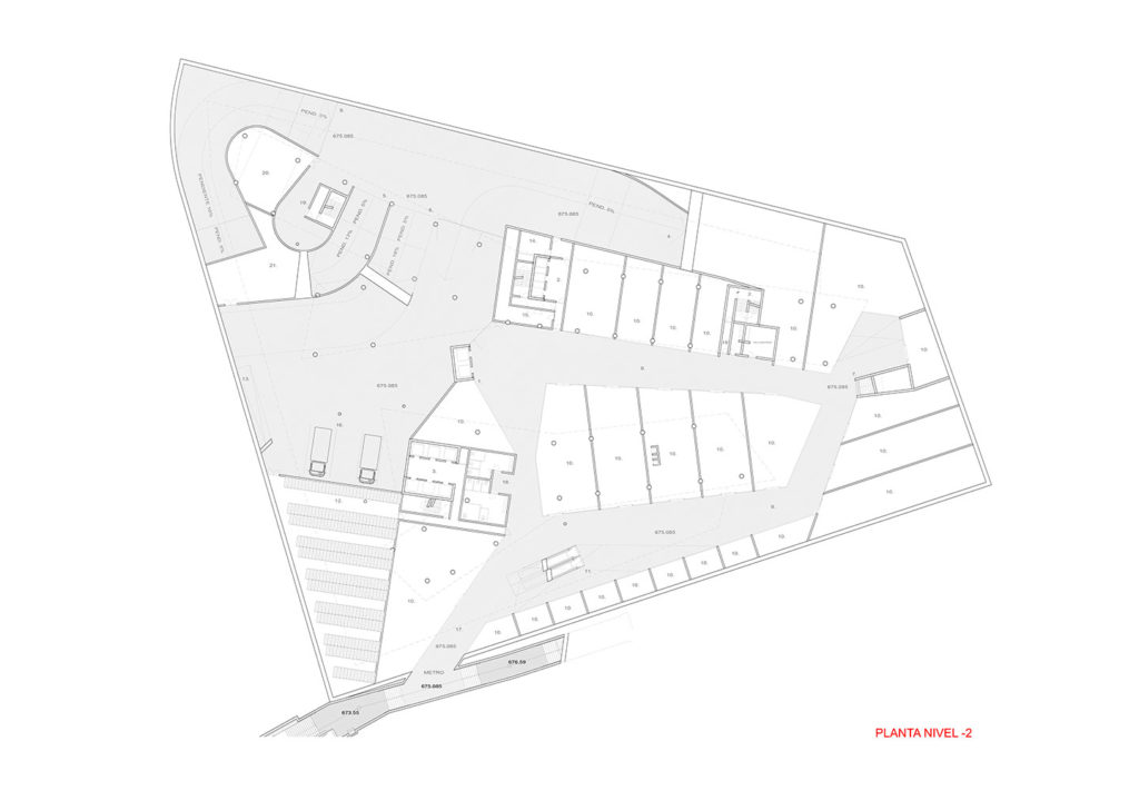
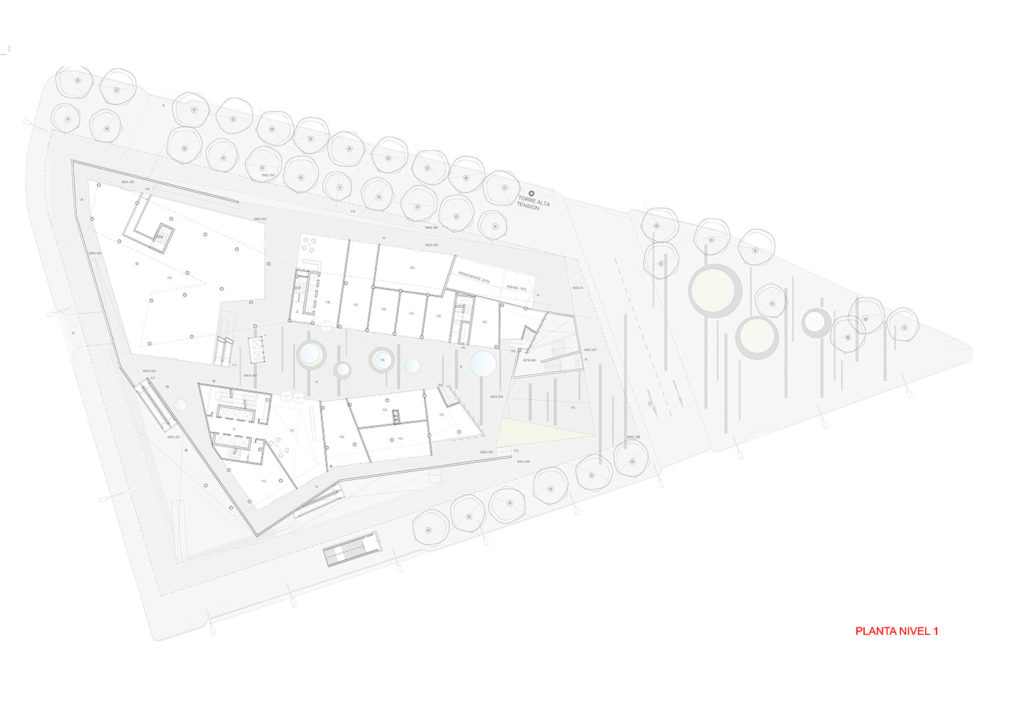
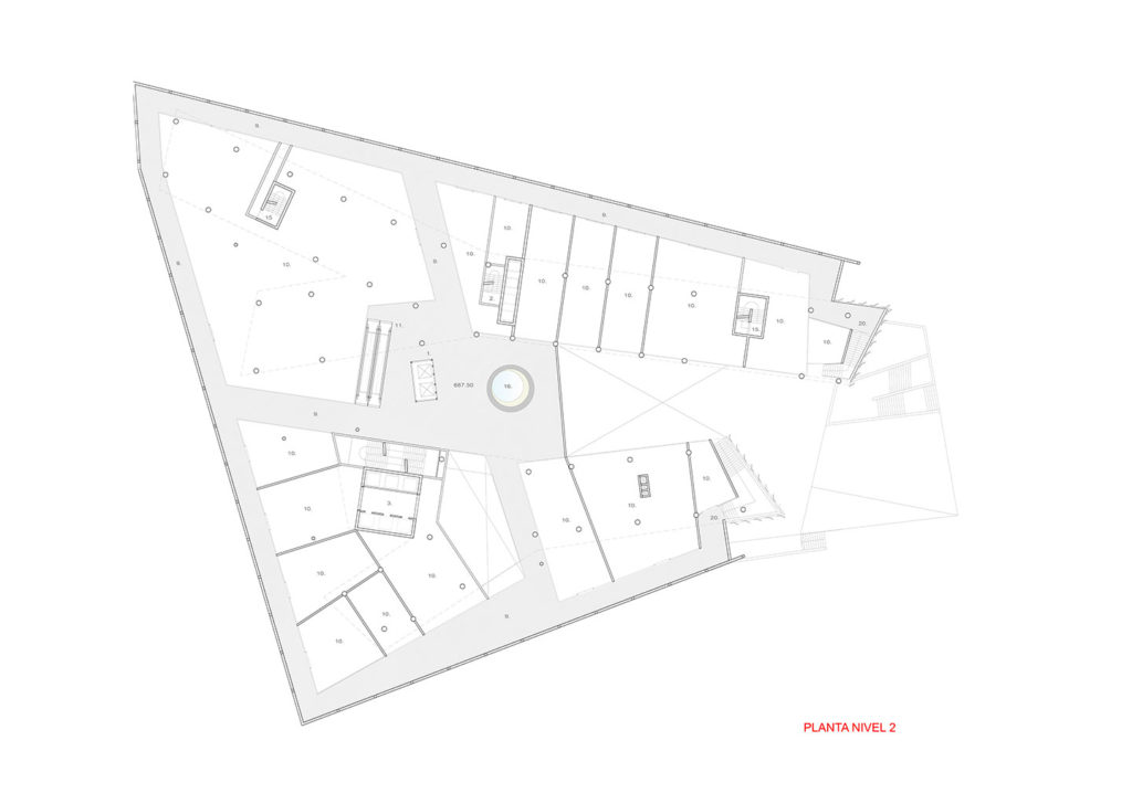
The commercial plate is developed on four levels, plus an intermediate level, ranging from -2 to 2, which takes advantage of the steep slope of the terrain, establishing various ways and levels of connection with the sidewalks to which it accesses, multiplying the commercial space and giving fluidity to trade. The flow has been organized by opening views and perspectives that go from one street to another and/or from one floor to another, in addition to bringing it to the perimeter on the upper floors so as to animate the facade with the movement of people and give a perception of public space to the commercial area. Level -2 of the commercial plate has a clear height of 5.5 meters, which allows mezzanines for level -2 in all of the stores, sub-floors to the stores on level -1, or large stores suitable for department stores using from one to five levels for retail.
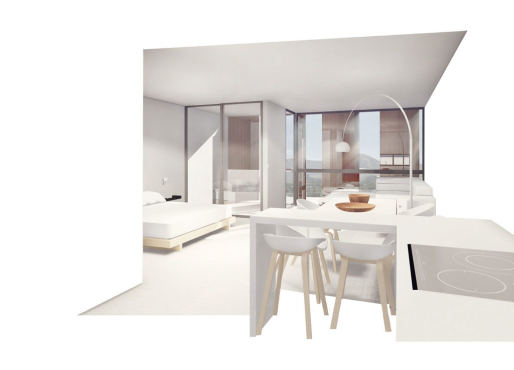
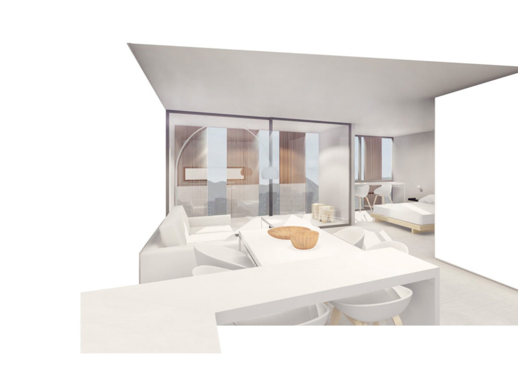
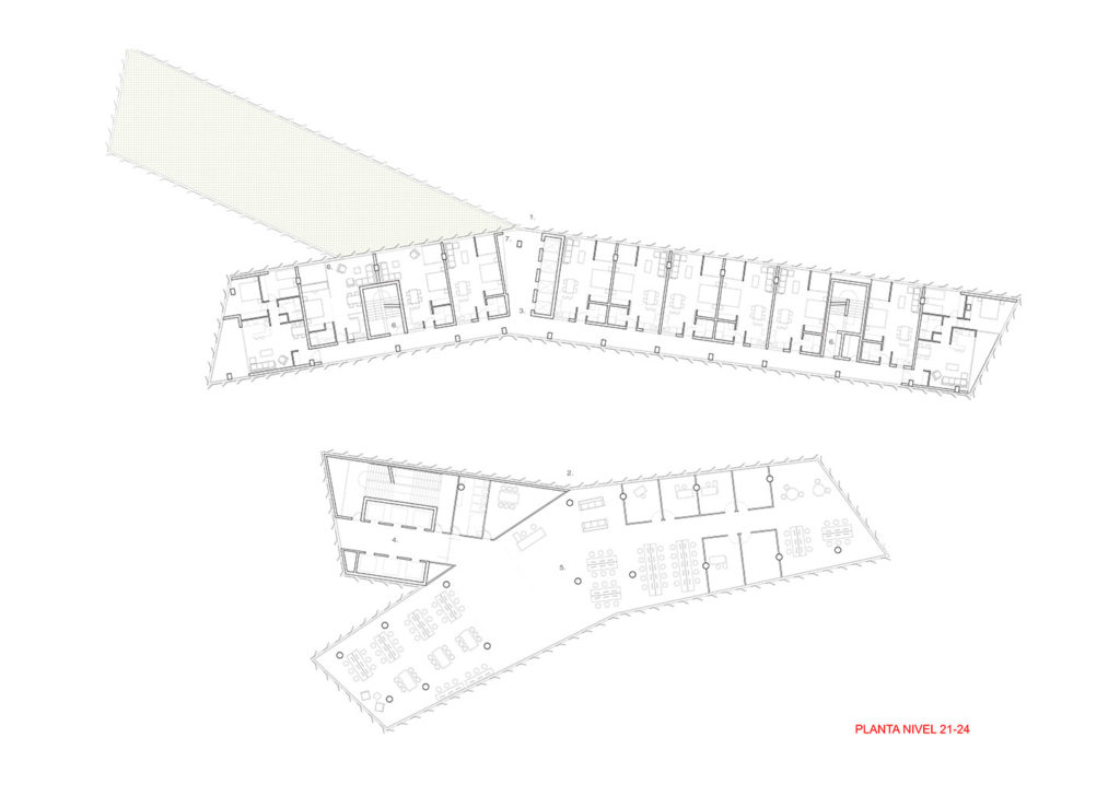
In the residential building, we have worked on a proposal of apartment typologies that, despite their limited program and surface area, constitute a novel alternative. In addition to this, we have opted for an exterior distribution circulation of the apartments, which provides fresh air, as well as natural light that is increased by the bouncing of the sun on the north facade of the office building. For the offices, three alternatives of full or partial floors have been developed, with a central hallway that allows for common work spaces or subdivisions on both sides with a central corridor.
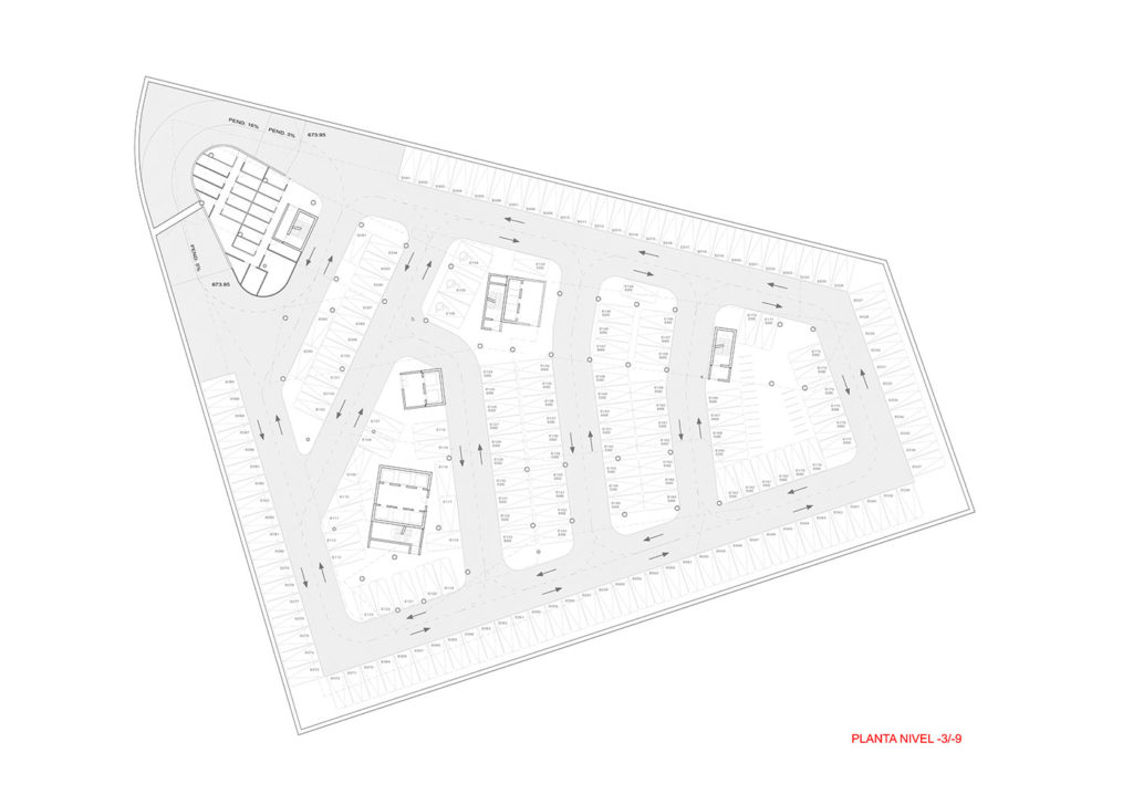
The subway levels have been organized with a very fluid and efficient parking floor plan, leaving the residential garages and their respective warehouses on the lower floors and the office parking on the upper floors. The floor closest to the subway connection has preferential parking for low-emission vehicles. Bicycle parking, as well as loading and unloading space, is located on subfloor 2, which corresponds to the access to the subway.
With respect to sustainability, a sensible architecture has been favored, based on the correct position of the programs with respect to sunlight, with housing to the north, offices to the south and reducing the west to a minimum. A lot of perimeter has been given in order to facilitate cross ventilation, avoiding Mediterranean enclosures, providing natural light to almost all the rooms (except for some bathrooms). A system of brisolei that separated 40 cms from the facade, whose function is to establish a double skin that causes natural ventilation by convection, in addition to screening the light and giving privacy to the rooms that require it has been arranged.
A percentage of the windows in both towers are operable, so as to take advantage of the large number of months and hours to obtain a comfortable temperature, using natural ventilation. The office building’s bay is slender so that 100% of the office spaces will have a direct view of the exterior. The toilets will be low consumption, incorporating a gray water treatment plant, which will be used to irrigate the gardens. The species chosen will be native. Thermo-solar panels will be incorporated into the non-trafficable roofs of the towers. The colors of these elements are differentiated and in intermediate tones in order to avoid undesired overheating. The roofs of the buildings are generally walkable spaces with the incorporation of terraces, public spaces and gardens planted with low water consumption species, which improves thermal insulation and prevents overheating.
A 5% of preferential parking has been allocated on the level below the access to the subway (58 parking spaces). In addition, parking for 600 bicycles has been provided on two levels at the subway access level, maximizing the use of space. A clean point for waste recycling was established in the first subway level, adjacent to the loading and unloading area.
During the hottest months in Santiago is the windy season, when the wind blows preferentially from west to east, which the design takes advantage of to create a venturi effect to provide better passive cooling. In the winter months, because the angle of the sun is very low, the reflectivity of the north façade of the office building is used to incorporate natural light into the central courtyard access to the volumes. The residential building takes advantage of the heat from the sun in winter, which enters the apartments, requiring little heating.
The structure is repetitive and continuous from the basement to the upper floors, based on columns, capitals, beams and slabs, with conventional bays. To solve the cantilever of the second floor of the commercial plate, which frees the pedestrian floor from obstacles and creates a double-height public atrium, a steel virendel beam was used. The break in the residential building and the change of direction of the floors of the apartments, has been given vertical continuity at the intersection of the walls of one floor with the other.
The curtain wall is a mixture of a fixed brisolei and a conventional carpentry that is solved between slabs, allowing operable windows. The brisolei is composed of a fixed frame and a folded enameled steel sheet of variable geometry and opening, which, based on greater or lesser opacity, will provide the comfort required by each program. This will be distanced from the facade according to the different requirements of each orientation, and will always leave a percentage of free glazing, which, in the north orientation, will be supplied by a 20-cm horizontal visor, preventing direct sunlight from entering in summer, but allowing it to pass through in winter. The east and west orientation will be covered by the angle of incidence of the respective plane.

